Mobile Playground
The Mobile Playground is a sample React Native banking app. It lets you build and test widgets and features locally using a realistic user interface, without requiring Candescent network services or a live financial institution.
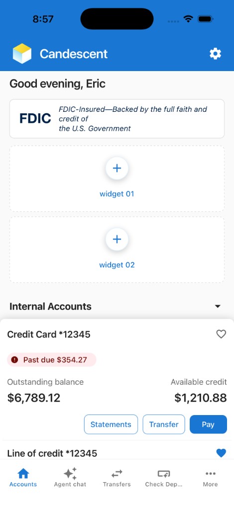
It includes a banking-style Accounts screen with mock data, three dedicated widget slots, a More menu where optional features can be added, and editable placeholder tabs.
Prerequisites
| Requirement | Notes |
|---|---|
| Expo CLI | Included with the sandbox (pnpm exec nx start mobile-sandbox) — no global install needed |
| iOS Simulator (macOS) | Expo iOS setup or physical device with Expo Go |
| Android Emulator | Expo Android setup or physical device with Expo Go |
Quick Start
Follow these steps in order. All commands run from the cdx-extensibility-apps repository root (the directory that contains package.json and nx.json).
cdx-extensibility-apps uses pnpm (pnpm@9.15.9 via Corepack). Use pnpm run for package.json scripts (setup, sync:mobile). Prefix Nx with pnpm exec unless nx is already on your PATH. See pnpm run vs pnpm exec.
-
Clone and install — Clone the cdx-extensibility-apps repository, then run:
Bashcorepack enable
corepack prepare pnpm@9.15.9 --activate
pnpm run setuppnpm run setupinstalls the web/Nx root and the mobile sandbox. Confirmpnpm -vprints9.15.9before installing. Ifcorepack enablefails withEACCES(macOS/Linux) orEPERM(Windows), see Corepack permission denied. -
Start the playground
Bashpnpm exec nx start mobile-sandboxThis starts the Metro bundler on port 8083. Wait for the QR code or the Expo dev menu to appear.
-
Run on a platform — In the Metro / Expo terminal press:
i   → iOS Simulator (macOS only)
a   → Android emulator
Or install Expo Go on a physical device and scan the QR code.
Quick Preview
For faster iteration, you can preview one widget or one feature without loading the full Mobile Playground shell (tabs, home layout, and picker). Pass the registry id as the last argument to mobile-sandbox; Metro still runs the same app, but the simulator opens straight to the Preview screen for that target so you can tighten the edit–reload loop on a single package.
# Widget — opens Preview for that widget only
pnpm exec nx start mobile-sandbox investment-portfolio

# Feature — opens Preview for that feature only
pnpm exec nx start mobile-sandbox agent-chat
Omit the trailing id to launch the full playground (default home, tabs, and More menu).
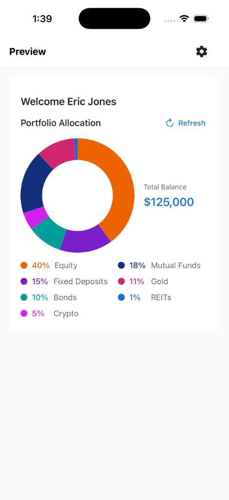
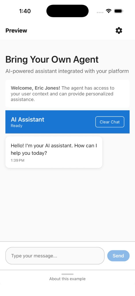
If the preview does not pick up your changes, press r in the Metro / Expo terminal to reload the app.
Valid IDs are any id field in registry/WIDGET_REGISTRY.ts or registry/FEATURE_REGISTRY.tsx.
Playground Overview
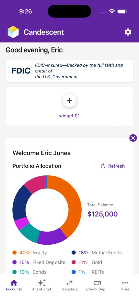
When you open the mobile playground, the Accounts tab is the default landing screen — a branded, scrollable home that mirrors the real mobile banking app, built with 100% synthetic mock data (no internal API contracts exposed).
What you see:
- Greeting bar — Personalized time-of-day greeting using
useUserContext()mock data and the active branding theme. - FDIC banner — Static disclosure card.
- Widget slots 01 and 02 — Dashed placeholder containers above the accounts block.
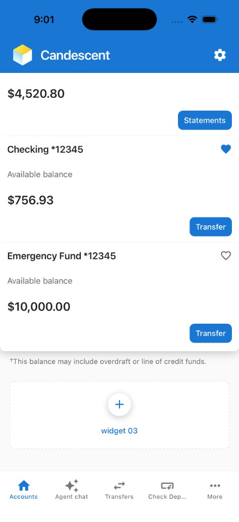
- Accounts section — Collapsible list with 5 mock accounts.
- Widget slot 03 — Dashed placeholder below the accounts section.
- Bottom tabs — Accounts · Agent Chat · Transfers · Check Deposit · More.
Theme Branding
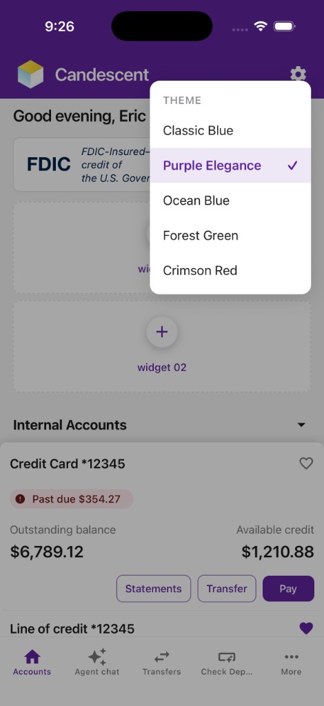
The playground includes a runtime branding switcher with five pre-configured themes: Classic Blue, Purple Elegance, Ocean Blue, Forest Green, and Crimson Red. Tap the settings (gear) icon in the header to open the picker and choose one.
Select a theme and the app re-renders with the new branding. A checkmark indicates the active theme. Switching only replaces the visual theme — widget slot assignments, features you added from More, and tab content stay as they are.
Branding switcher (settings icon in the header):
Widget Setup
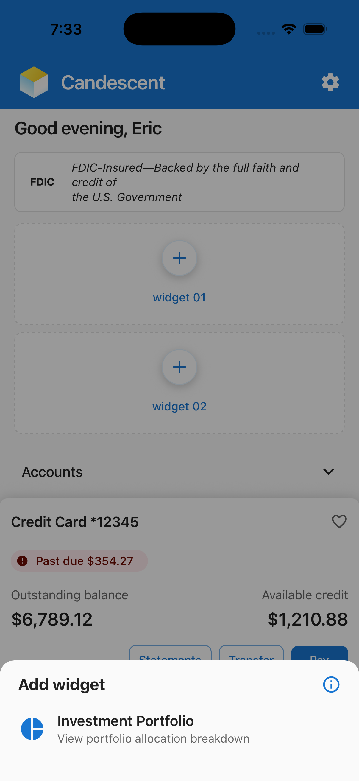
The Home Screen maintains three empty slots — widget 01, widget 02, and widget 03 — each displayed with + placeholders. Tapping any slot opens WidgetPickerModal.
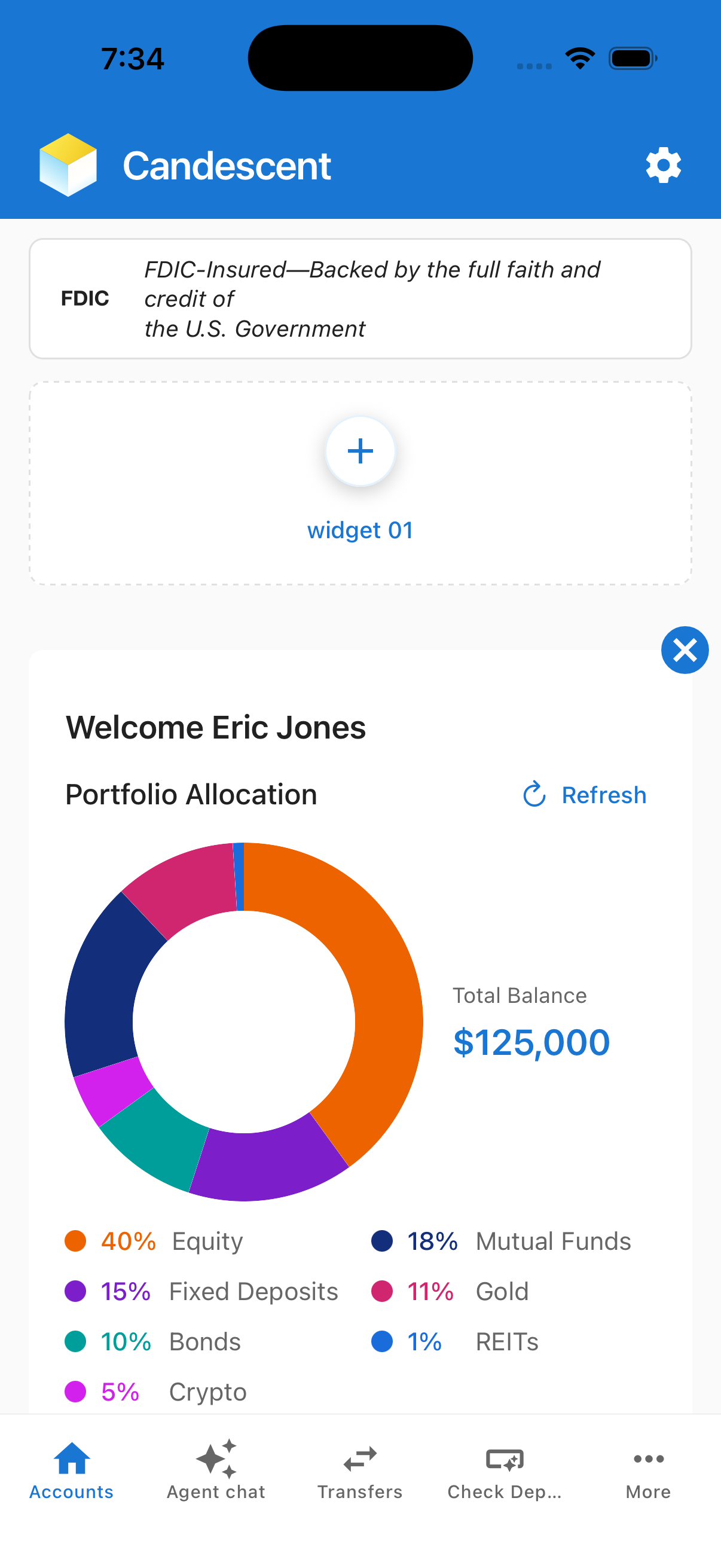
The picker lists every entry in WIDGET_REGISTRY. Tapping an entry assigns it to that slot and renders the widget component with the same props the production host passes:
<w.component
  scrollable={false}
  httpClient={PlatformSDK.getInstance().getHttpClient()}
  name={w.id}
  modalRef={widgetModalRef}
/>
A cancel icon anchored to the top-right corner of the hosted widget resets the slot back to the placeholder state.
Adding a widget
Follow these steps in order. All commands run from the cdx-extensibility-apps repository root (the directory that contains package.json and nx.json).
-
Generate the package — To scaffold a new widget, follow the steps in Getting Started. The generator also appends a new
WidgetRegistryItemtoregistry/WIDGET_REGISTRY.tsautomatically — no manual edits needed. -
Sync and reload — After generate, sync the mobile sandbox lockfile, then choose one launch option:
Bashpnpm run sync:mobile # picks up the new file: dep
# Quick preview — opens Preview for your widget only (registry id)
pnpm exec nx start mobile-sandbox <widget-name>
# Full playground — home, widget slots, and picker
pnpm exec nx start mobile-sandboxAfter generateRed
specifiers in the lockfile don't matchthen[sync-mobile-sandbox]during catalog generate is expected — wait for the green Nx success. Do not runpnpm run ci:mobileuntil that sync finishes.pnpm exec nx start mobile-sandboxalso syncs automatically. See Sandbox lockfile out of sync.
- Quick preview — pass your widget’s registry
id(fromWIDGET_REGISTRY.ts) as the last argument. - Full playground — omit the argument, then tap
+on any slot → the picker lists your widget → select it to see it live.
Widget Registry - playground/mobile-sandbox/registry/WIDGET_REGISTRY.ts is the single source of truth for the widget picker. The WidgetPickerModal reads this array at runtime.
export const WIDGET_REGISTRY: WidgetRegistryItem[] = [
  {
    id: 'investment-portfolio',
    name: 'Investment Portfolio',
    description: 'View portfolio allocation breakdown',
    icon: '📊',
    materialIcon: 'pie-chart',
    component: PortfolioAllocationScreen,
  },
  // generator appends new rows just before the closing ];
];
The generator contract requires every entry (including the last) to end with a trailing comma, and the closing ]; to stay on its own line. Do not reformat this file manually.
Feature Setup
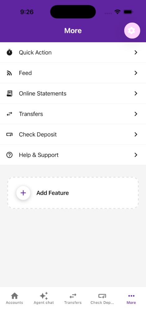
The More tab renders MoreNavigator, a NativeStackNavigator with two screens:
| Screen | Purpose |
|---|---|
MoreMenu | Scrollable list of feature rows + Add Feature slot |
FeatureDetail | Full-screen component for a selected feature |
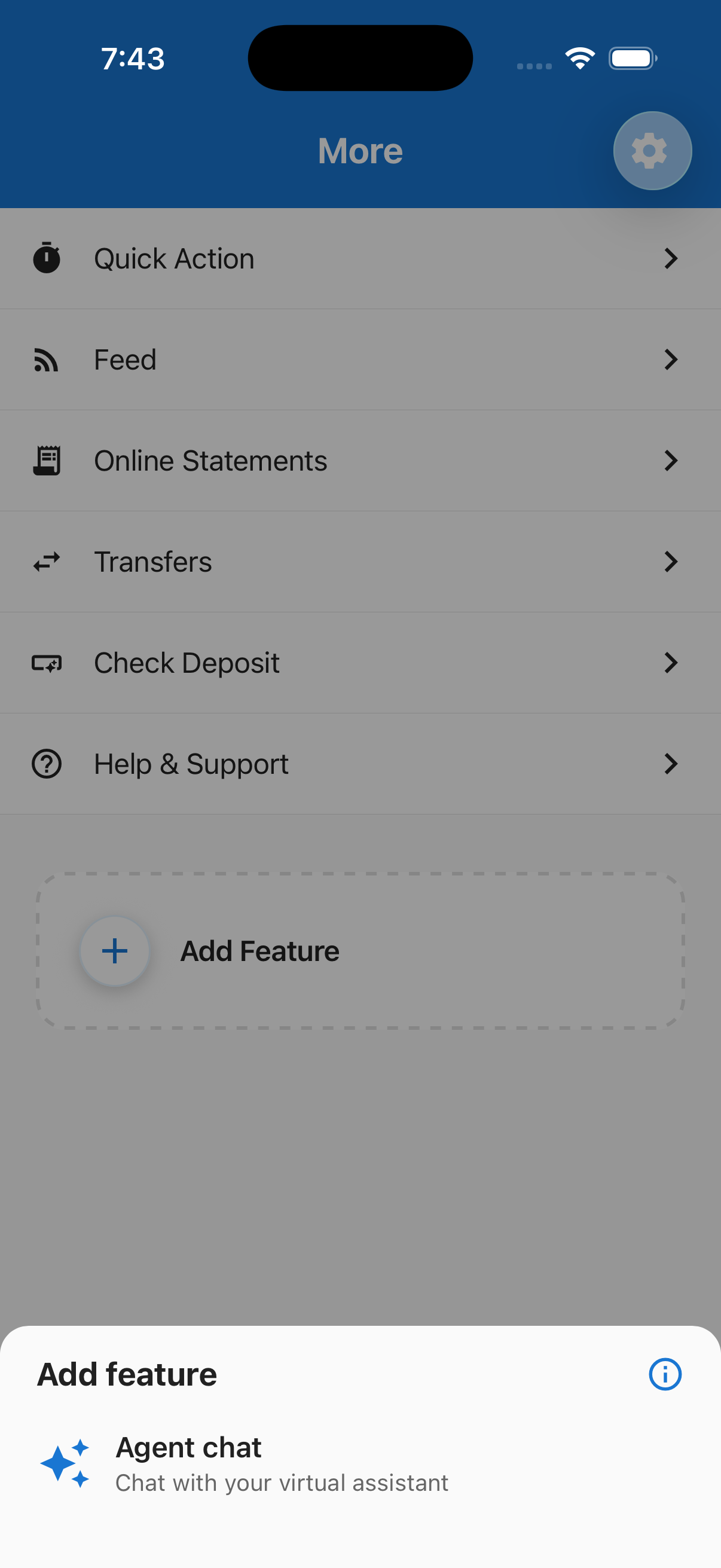
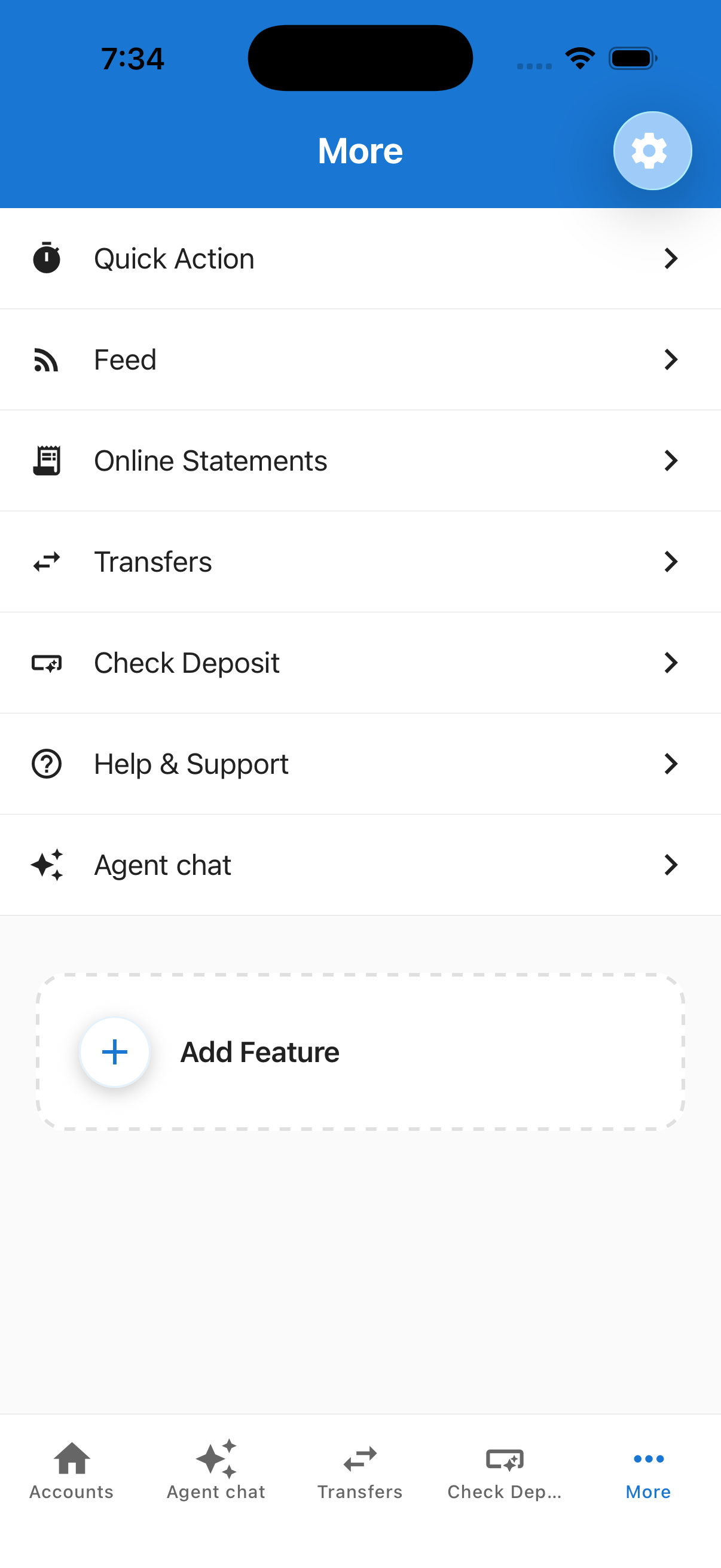
MoreMenuScreen reads FEATURE_REGISTRY and splits it into two sets:
- Visible rows — entries where
builtIn: true, plus anybuiltIn: falseIDs the user added via Add Feature in the current session (AddedFeaturesContextholds these in memory only; they reset on reload or when the process exits). - Addable — entries where
builtIn: falsethat are not yet in the visible list. Shown inFeaturePickerModalwhen the user taps Add Feature.
When a row is tapped:
navigateToTabis set → the parent tab navigator switches to that tab withfromMore: true, mirroring real mobile banking app navigation (no duplicate stack push).- No
navigateToTab→navigation.navigate('FeatureDetail', { featureId })pushes the feature's component onto the More stack.
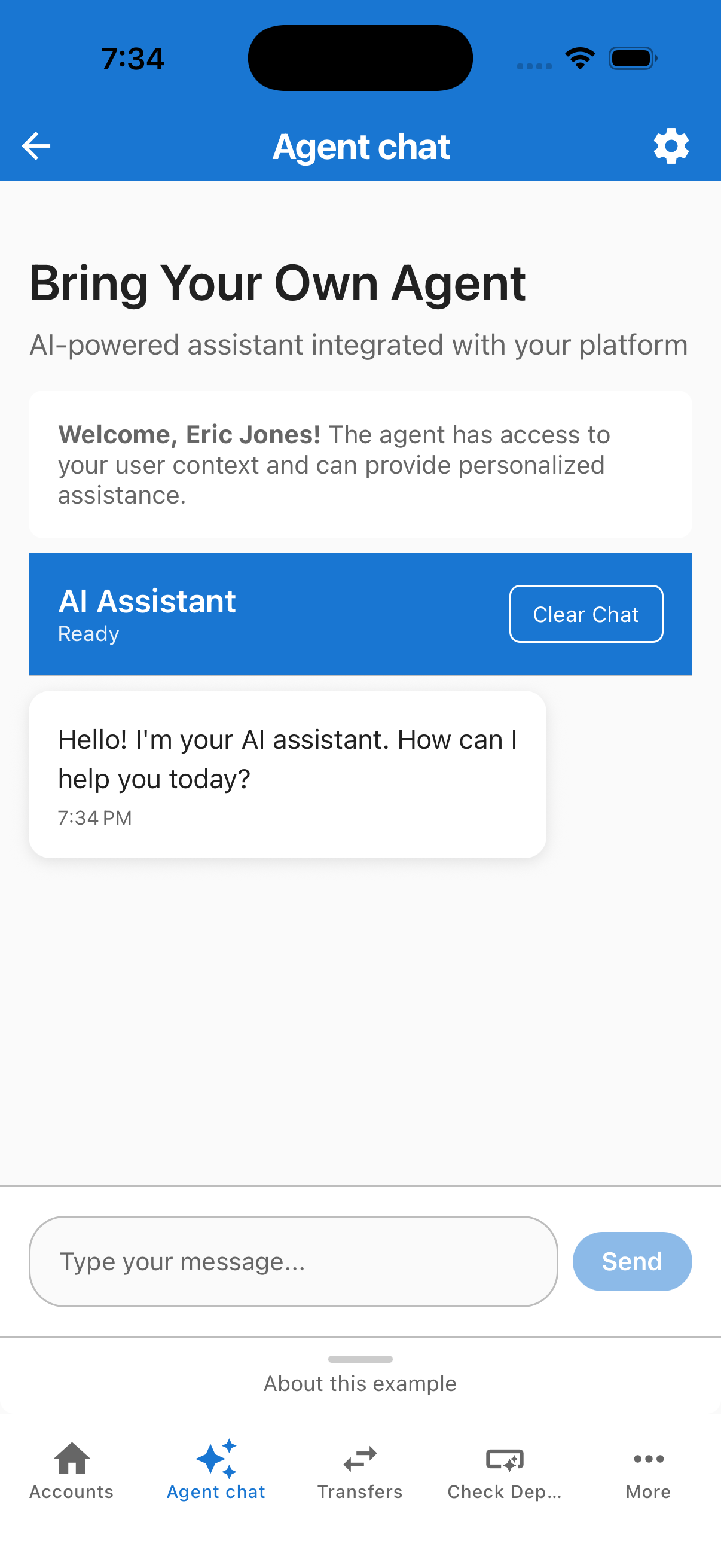
Adding a feature
Follow these steps in order. All commands run from the cdx-extensibility-apps repository root (the directory that contains package.json and nx.json).
-
Generate the package — To scaffold a new feature, follow the steps in Features — Getting Started. The generator also appends a
builtIn: falseentry toregistry/FEATURE_REGISTRY.tsxautomatically — no manual edits needed. -
Sync and reload — After generate, sync the mobile sandbox lockfile, then choose one launch option:
Bashpnpm run sync:mobile # picks up the new file: dep
# Quick preview — opens Preview for your feature only (registry id)
pnpm exec nx start mobile-sandbox <feature-name>
# Full playground — home, tabs, More menu, and picker
pnpm exec nx start mobile-sandboxAfter generate, see Sandbox lockfile out of sync if catalog generate reported a lockfile mismatch.
- Quick preview — pass your feature’s registry
id(fromFEATURE_REGISTRY.tsx) as the last argument. - Full playground — omit the argument, then open More → Add Feature → your feature appears in the picker → select it to add it to the list.
- Promote to built-in (optional) — Change
builtIn: falsetobuiltIn: trueinFEATURE_REGISTRY.tsxto make the feature visible by default without the picker step.
Feature Registry - playground/mobile-sandbox/registry/FEATURE_REGISTRY.tsx is the single source of truth for the More menu and the Add Feature picker.
export const FEATURE_REGISTRY: FeatureRegistryItem[] = [
  // Built-in rows (always visible in More)
  { id: 'quick-action',      label: 'Quick Action',      description: 'Shortcuts for common banking tasks',           icon: '⏱', materialIcon: 'timer',         builtIn: true,  isPlaceholder: true, component: QuickActionScreen },
  { id: 'feed',              label: 'Feed',              description: 'Activity and updates in one place',          icon: '📡', materialIcon: 'rss-feed',      builtIn: true,  isPlaceholder: true, component: FeedScreen },
  { id: 'online-statements', label: 'Online Statements', description: 'View and download your statements',          icon: '📄', materialIcon: 'receipt-long',  builtIn: true,  isPlaceholder: true, component: OnlineStatementsScreen },
  { id: 'transfers',         label: 'Transfers',         description: 'Move money between your accounts',           icon: '↔️', materialIcon: 'swap-horiz',   builtIn: true,  navigateToTab: 'Transfers', component: TransfersPlaceholderScreen },
  { id: 'check-deposit',     label: 'Check Deposit',     description: 'Deposit checks from your phone',             icon: '📸', materialIcon: 'smart-button',  builtIn: true,  navigateToTab: 'Payments',  component: PaymentsPlaceholderScreen },
  { id: 'help',              label: 'Help & Support',    description: 'Get answers and contact support',            icon: '❓', materialIcon: 'help-outline',  builtIn: true,  isPlaceholder: true, component: HelpScreen },
  // Available via Add Feature picker (builtIn: false — generator default)
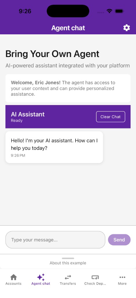
  { id: 'agent-chat',        label: 'Agent chat',        description: 'Chat with your virtual assistant',           icon: '💬', materialIcon: 'auto-awesome',  builtIn: false, navigateToTab: 'AgentChat',  component: AgentChatBody },
  // generator appends new rows just before the closing ];
];
Navigating to a tab vs. pushing a stack screen
Set navigateToTab to route a More menu row to an existing bottom tab instead of pushing a nested stack screen. The valid values mirror RootTabParamList:
navigateToTab | Behaviour |
|---|---|
'AgentChat' | Switches to the Agent Chat tab (passes fromMore: true) |
'Transfers' | Switches to the Transfers tab (passes fromMore: true) |
'Payments' | Switches to the Check Deposit tab (passes fromMore: true) |
| (omitted) | Pushes FeatureDetail screen on the More stack |
When fromMore: true is in route params, the tab header shows a back to More button via useHeaderBackToMore.
Placeholder Tab
The Transfers and Check Deposit tabs currently render PlaceholderFeatureScreen with a developer callout explaining how to replace them.
In navigation/tabs.tsx, each tab route uses a thin wrapper that enables back to More when the tab was opened from the More menu, then renders the placeholder from FEATURE_REGISTRY:
function TransfersTabScreen() {
  useHeaderBackToMore('Transfers');
  return <TransfersPlaceholderScreen />;
}

function PaymentsTabScreen() {
  useHeaderBackToMore('Payments');
  return <PaymentsPlaceholderScreen />;
}
The stack header title, tab bar label, and tab bar icon for those routes are configured on the corresponding Tab.Screen options (not inside the wrapper functions). For example:
<Tab.Screen
  name="Transfers"
  component={TransfersTabScreen}
  options={{
    title: 'Transfers',
    tabBarLabel: 'Transfers',
    tabBarIcon: ({ color, size }) => (
      <SandboxMaterialIcon name="swap-horiz" color={color} size={size ?? SANDBOX_ICON_SIZE.tab} />
    ),
  }}
/>
<Tab.Screen
  name="Payments"
  component={PaymentsTabScreen}
  options={{
    title: 'Check Deposit',
    tabBarLabel: 'Check Deposit',
    tabBarIcon: ({ color, size }) => (
      <SandboxMaterialIcon name="smart-button" color={color} size={size ?? SANDBOX_ICON_SIZE.tab} />
    ),
  }}
/>
Replacing a placeholder tab
Example — replace Transfers with a real screen:
-
Create or import your screen component:
// features/mobile/my-scheduled-payments/src/MyScheduledPaymentsScreen.tsx
export function MyScheduledPaymentsScreen() {
  // your implementation
} -
In
navigation/tabs.tsx, swap the placeholder insideTransfersTabScreen:import { MyScheduledPaymentsScreen } from '@my-fi-extensions/my-scheduled-payments';
function TransfersTabScreen() {
useHeaderBackToMore('Transfers');
return <MyScheduledPaymentsScreen />; // ← replaces TransfersPlaceholderScreen
}Adjust the
TransfersTab.Screenoptions(title,tabBarLabel,tabBarIcon) if your screen needs a different header or tab. -
Rebuild and reload:
Bashpnpm run sync:mobile
pnpm exec nx start mobile-sandbox
The same pattern applies to PaymentsTabScreen for Check Deposit (swap in your screen and adjust the Payments Tab.Screen options if needed).
The tab bar route order is fixed in navigation/tabs.tsx. For each tab, icons, tab bar labels, and stack header titles come from that route’s Tab.Screen options. Solely replacing the screen component does not change the tab entry; edit options when your real screen needs different labels or icons.
Troubleshooting
| Issue | Solution |
|---|---|
corepack enable permission denied | See Corepack permission denied (EACCES on macOS/Linux, EPERM on Windows). |
specifiers in the lockfile don't match during generate | Expected frozen-lockfile probe. Wait for [sync-mobile-sandbox] and the green Nx success. See Sandbox lockfile out of sync. |
| Metro can't resolve a workspace package | Check watchFolders, nodeModulesPaths, and extraNodeModules in metro.config.js. From the cdx-extensibility-apps repository root run pnpm run setup (first clone) or pnpm run sync:mobile after generate. |
| My widget doesn't appear in the picker | Confirm it is in WIDGET_REGISTRY.ts with a valid component. Rebuild the package and reload Expo. |
| My feature doesn't appear in Add Feature | Confirm it is in FEATURE_REGISTRY.tsx with builtIn: false, a non-empty description (Add picker copy), and a component. Rebuild and reload. |
| Changes not appearing after edit | Rebuild the package (pnpm exec nx run <name>:build), then reload Expo (R in terminal, or shake → Reload). |
| Port 8083 already in use | Stop other Metro instances or change the port in project.json. |
| iOS build fails | Ensure Xcode and iOS Simulator are installed (macOS only). See Expo iOS setup. |
| Android build fails | Ensure Android Studio, SDK, and emulator are set up. See Expo Android setup. |
Still stuck? Contact the Candescent platform team.